A collection of type + illustration focused projects.
Eastside Legends apparel Illustration for a youth baseball club in the East Portland. I got the opportunity to partner with an awesome team who let me go wild with some fun graphic work. I did a ton of exploration that led to the production of a few shirts and hoodies that now roam the baseline, bleachers and dugouts of the PNW.

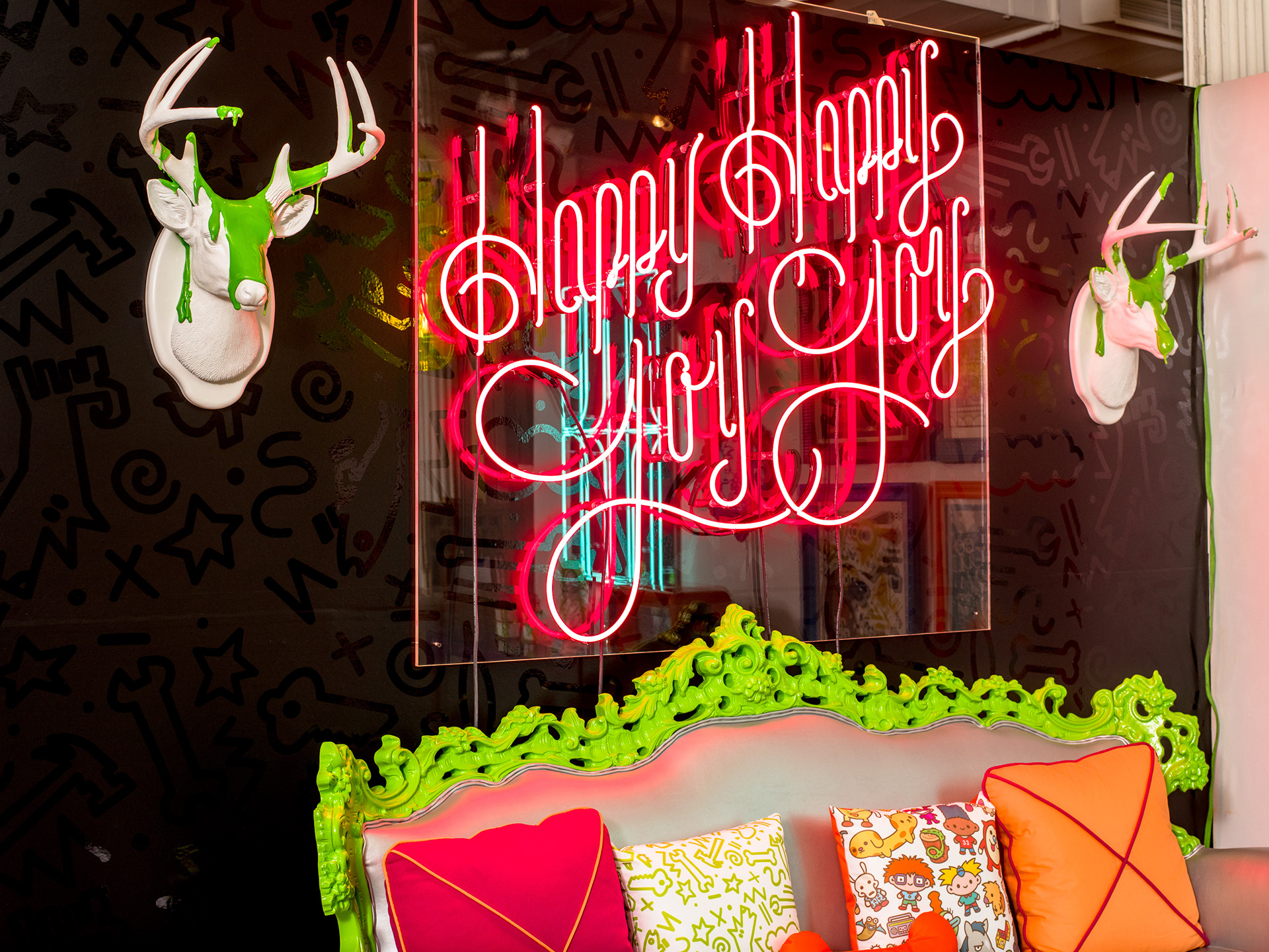
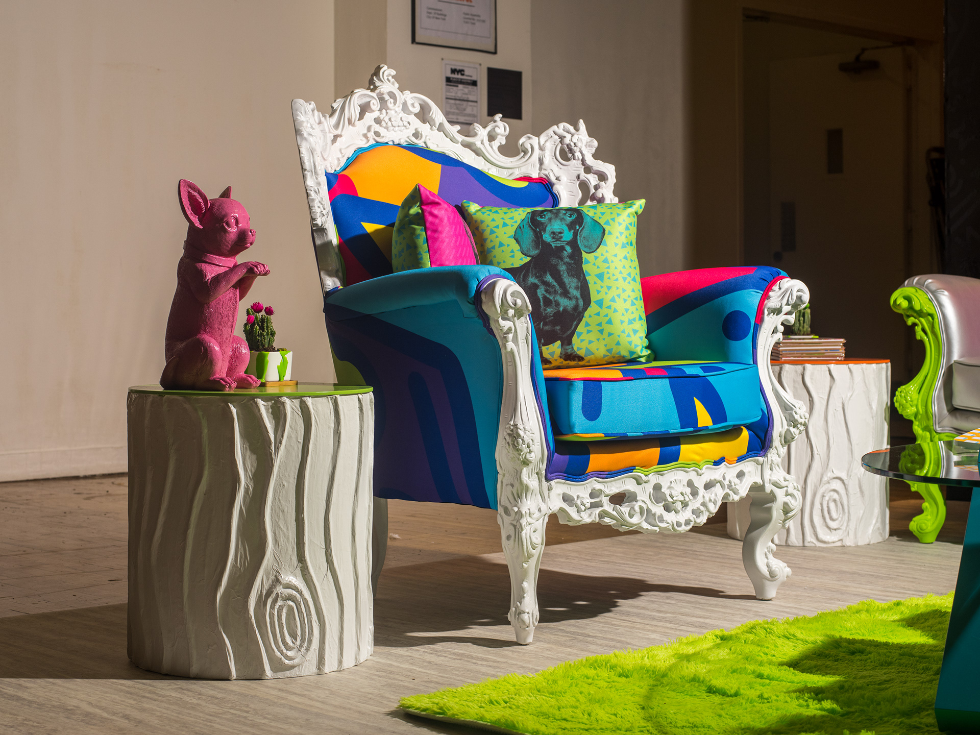
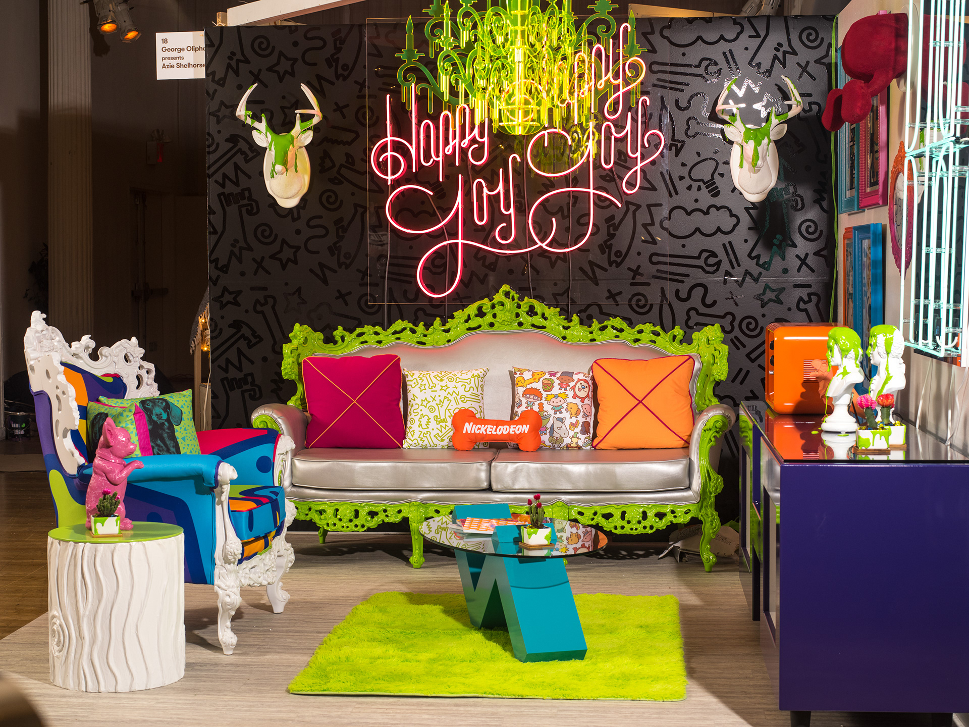
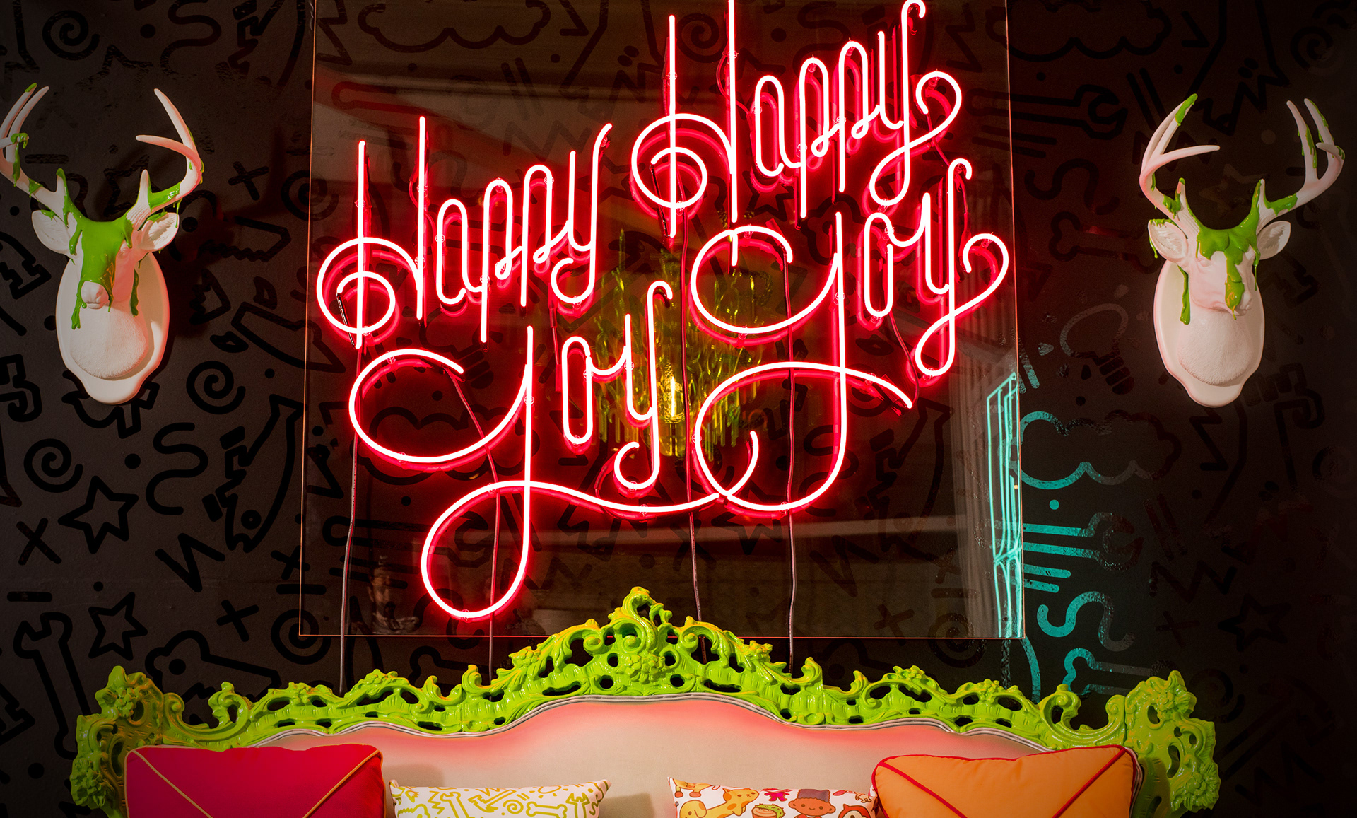
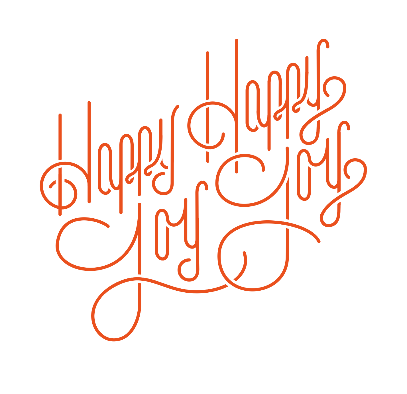
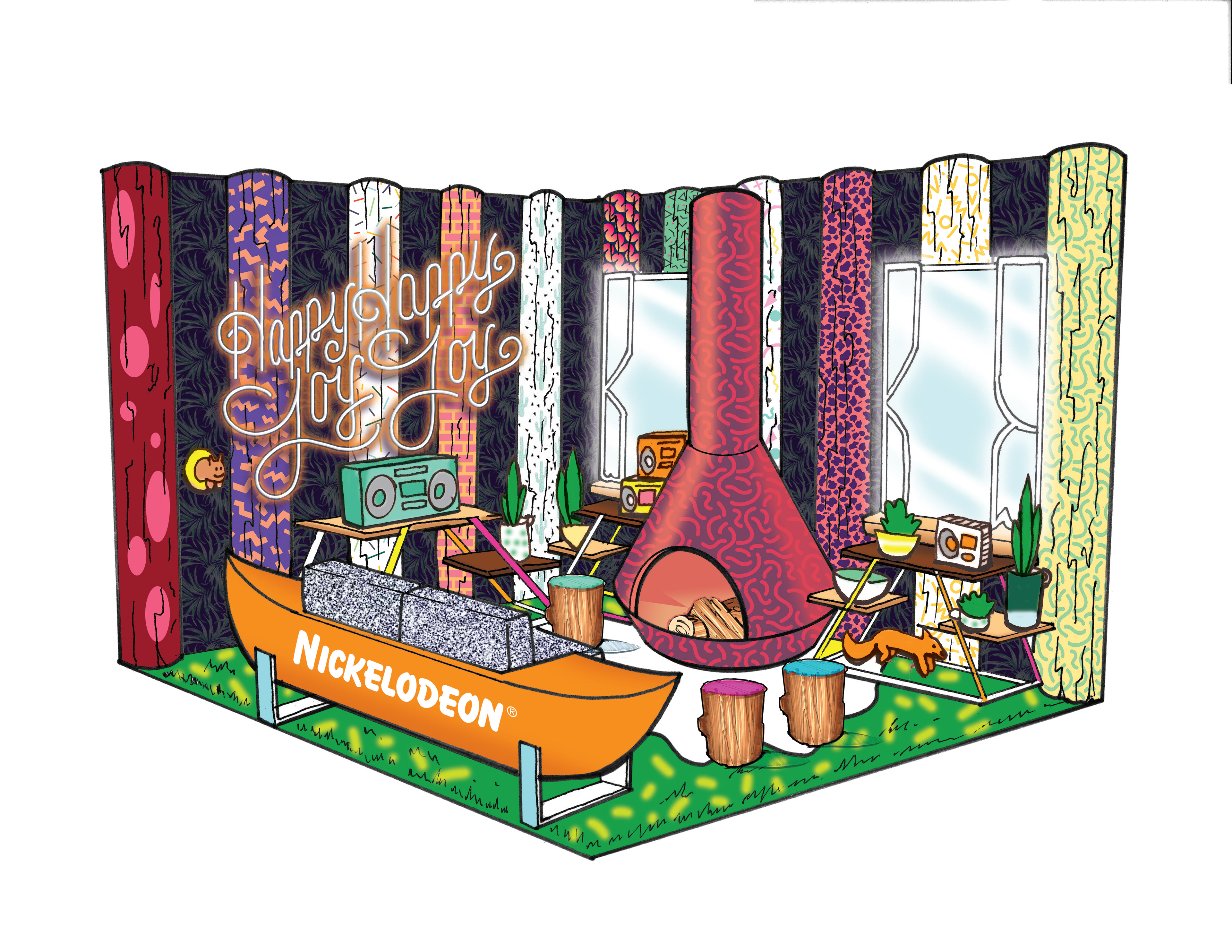
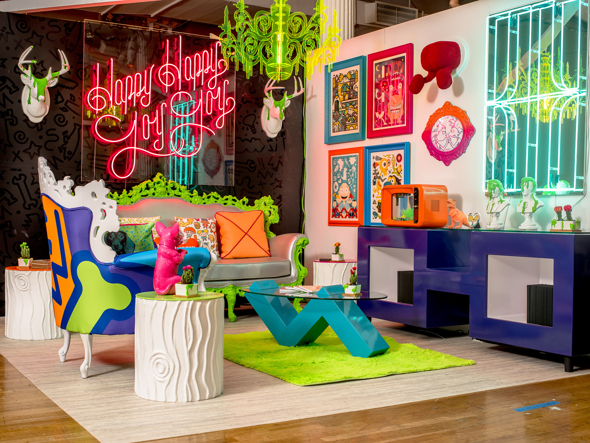
Nickelodeon : Design on a Dime Neon Sign
For Housing Works’ 2017 Design on a Dime event, we imagined a Nickelodeon superfan’s dream lounge. Taking inspiration from iconic 1990s properties like The Ren & Stimpy Show, Rugrats and Hey Arnold! as well as the green slime, we created custom-built furnishings that were sold to benefit Housing Works’ mission of ending AIDS and homelessness. My contribution involved crafting the Happy Happy, Joy Joy hand type that was recreated in neon. The project was a hit in person and ended up being featured in Communication Arts Design Annual.

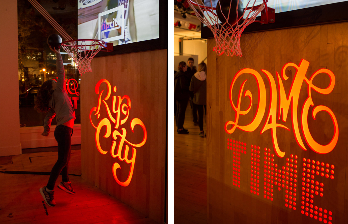
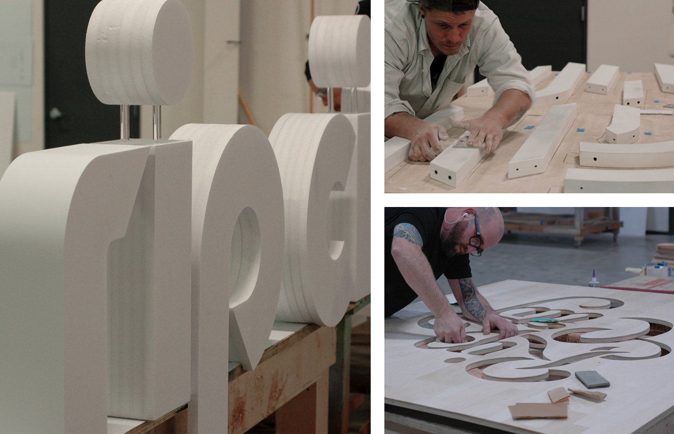
Portland Tailblazers: Rip City Celebration Event
The 135 Gallery curated an art show to celebrate the 40th anniversary of the Portland Trailblazers winning stumptown's lone sports title, (I know, I know the Timbers have a cup.) The November show was thus titled RipsGiving, in the spirit of the season and the tipoff of the 2016-2017 NBA season. The Gallery curated five choice areas in the space, poured kegs of beer, served up tasty snacks and had a great night. Often times, the most creative projects are born from the freedom that is afforded to internal work, away from client demands and layers of approvals.
I was asked to help create Blazer specific, hand-type phrases that were to be routed into our courtwood tv stand/basketball hoops. What started as a simple engraving soon expanded into a fully cut, back lit, red plex triangular beacon of awesome, shining out from the corner of the space into the city Park blocks in two directions, and into the show on the remaining side.


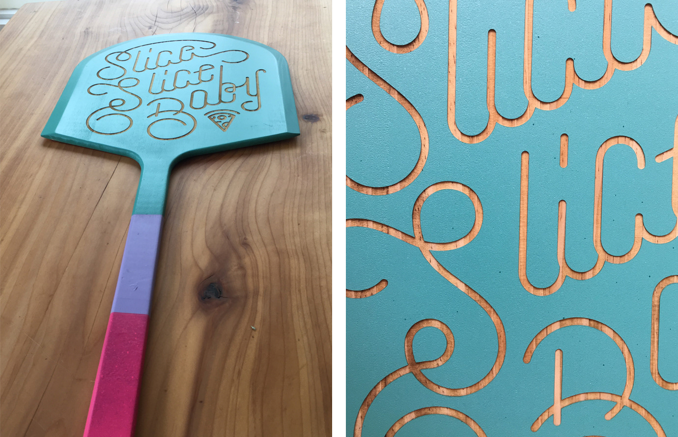
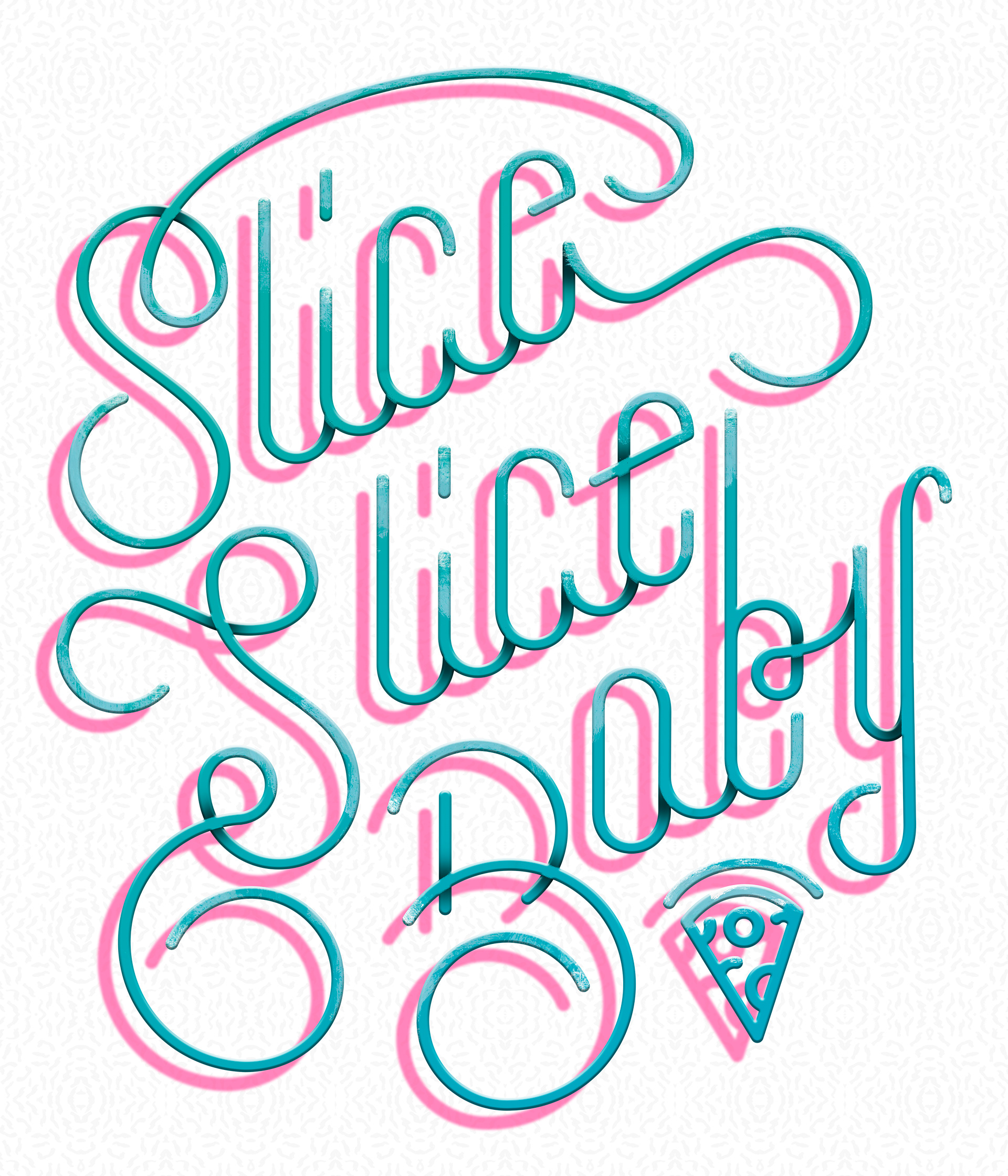
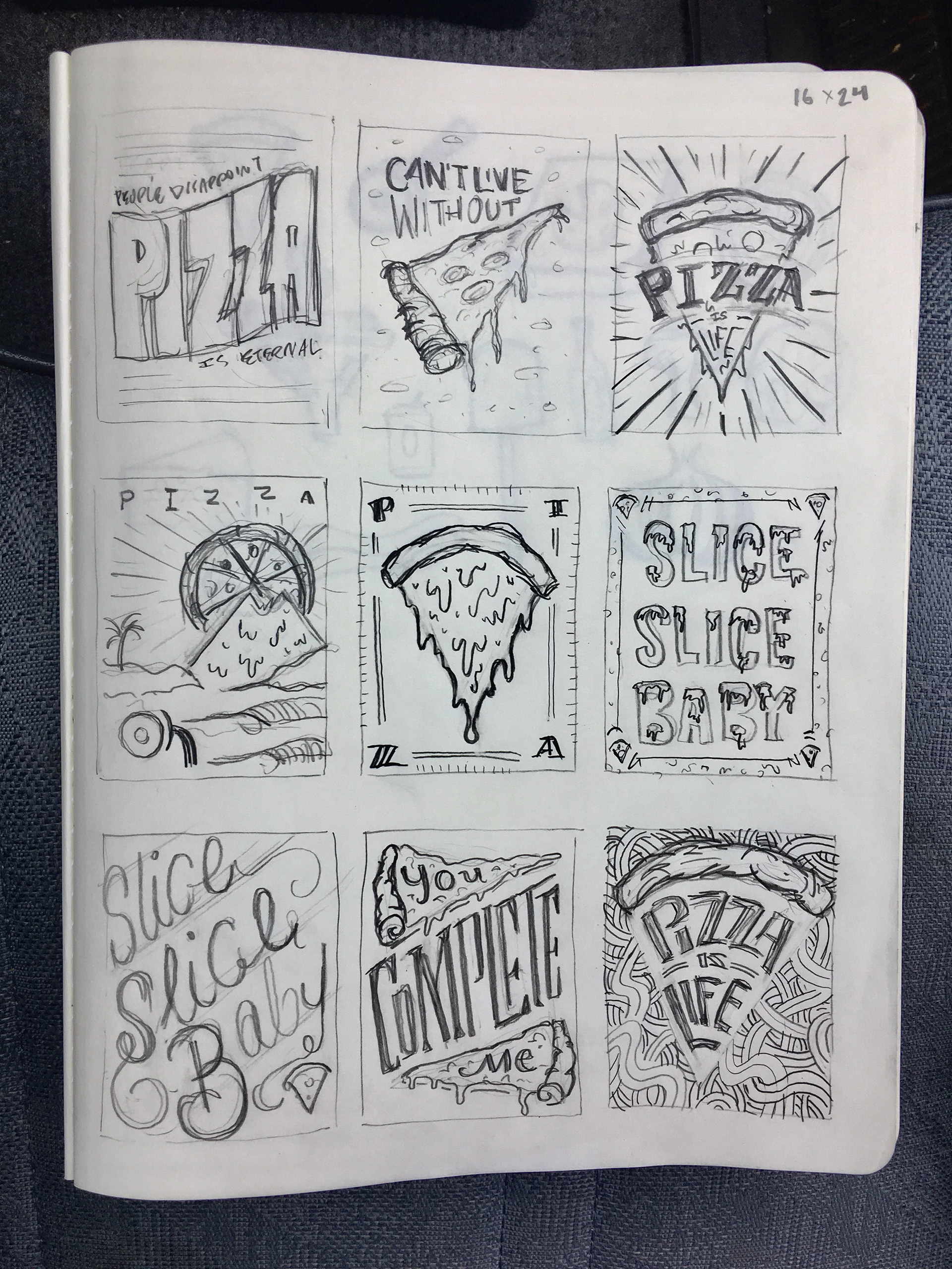
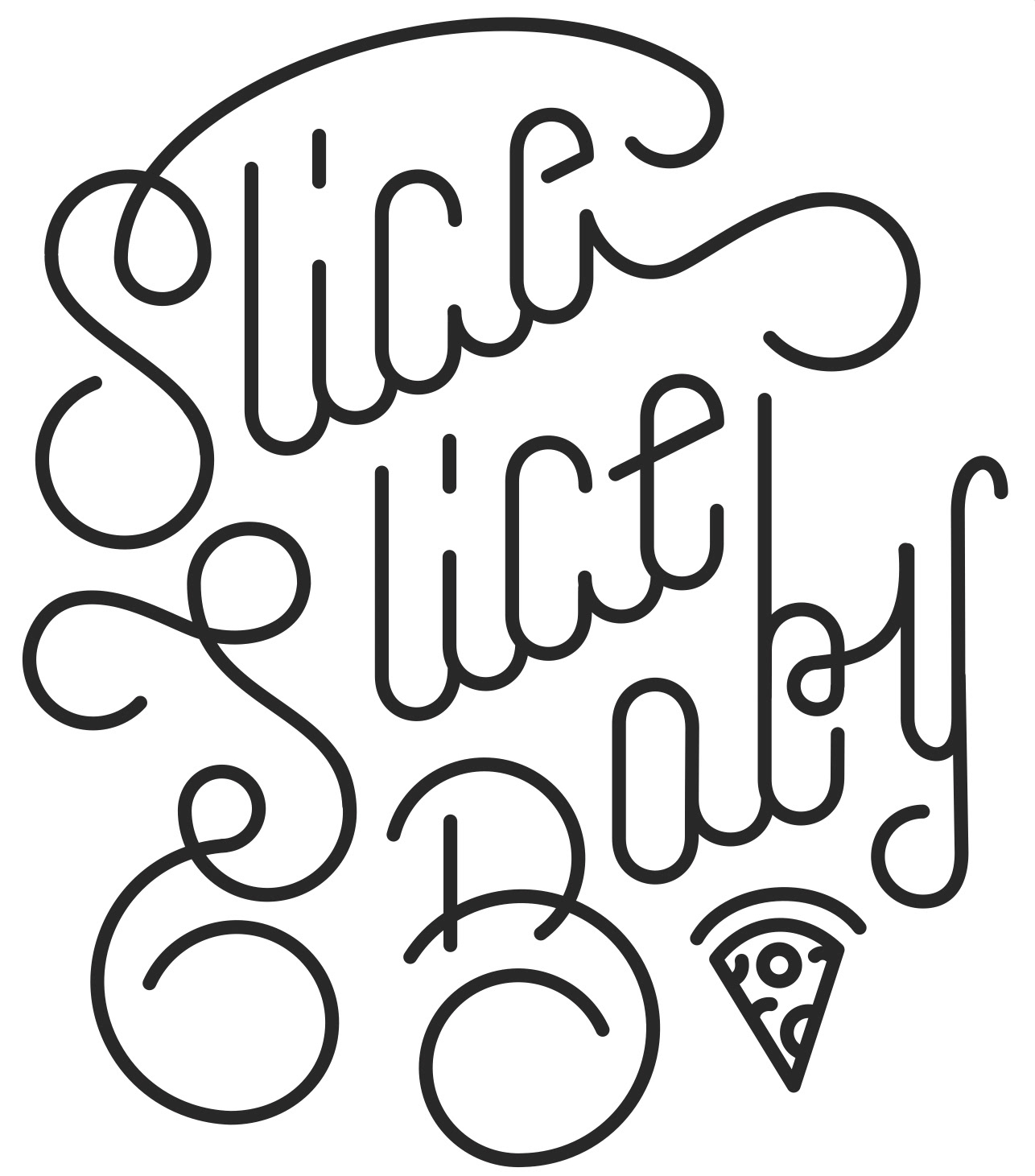
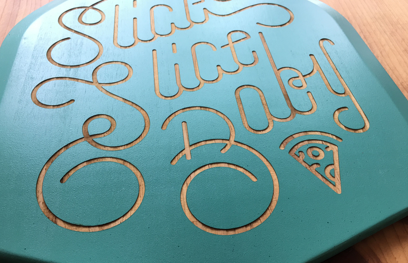
Design Week Portland : Pizza Peel Auction
Design Week Portland always brings about interesting art experiences and talks around town. In 2017 I ended up in a pizza peel auction at the 135 Gallery with this 80's inspired, laser engraved piece.
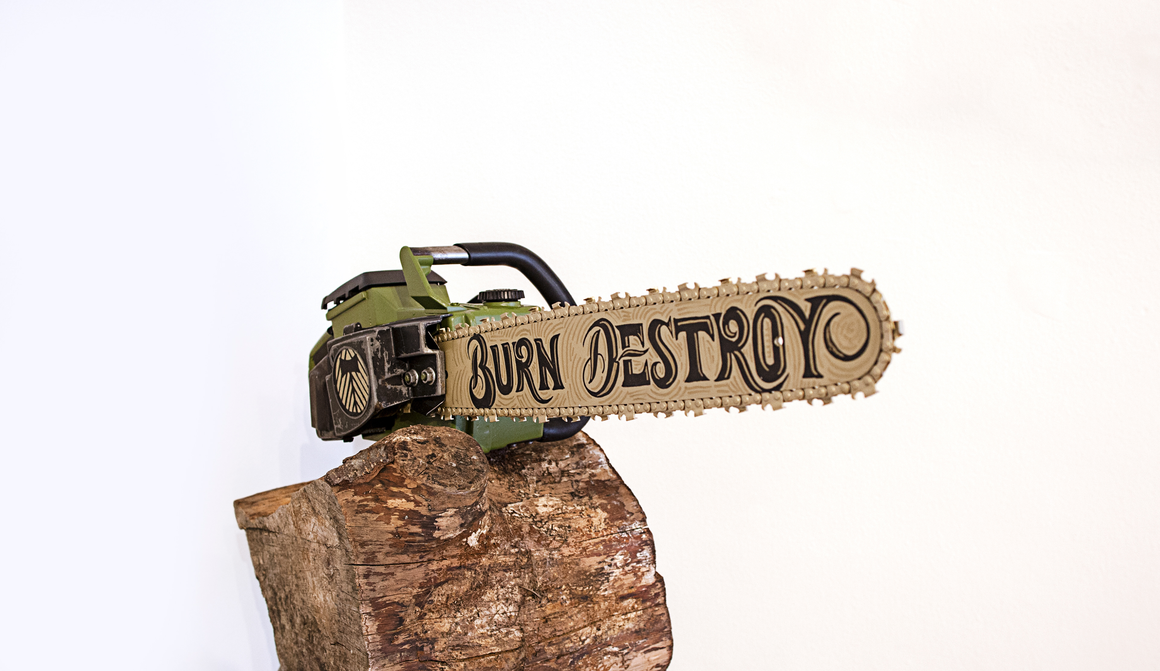
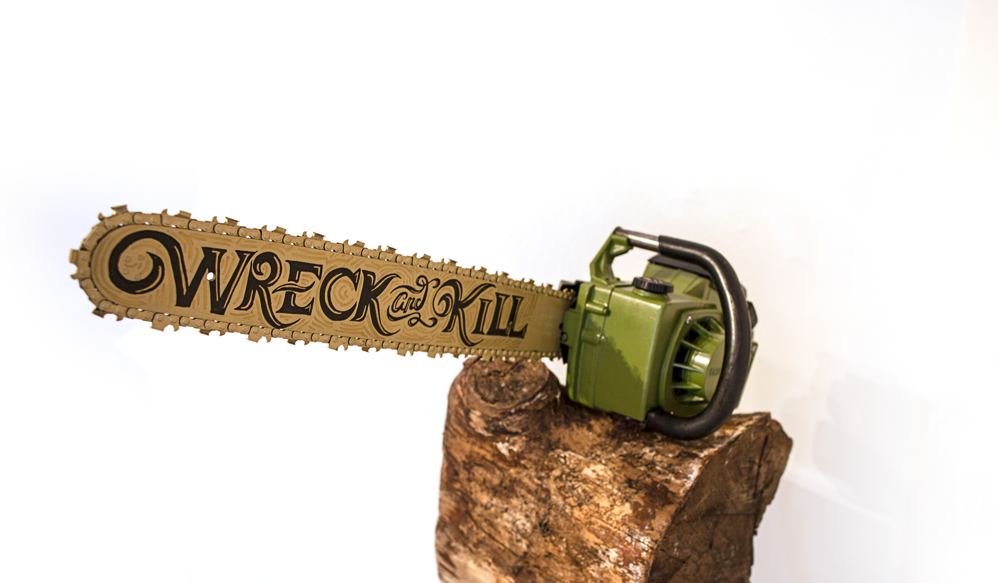
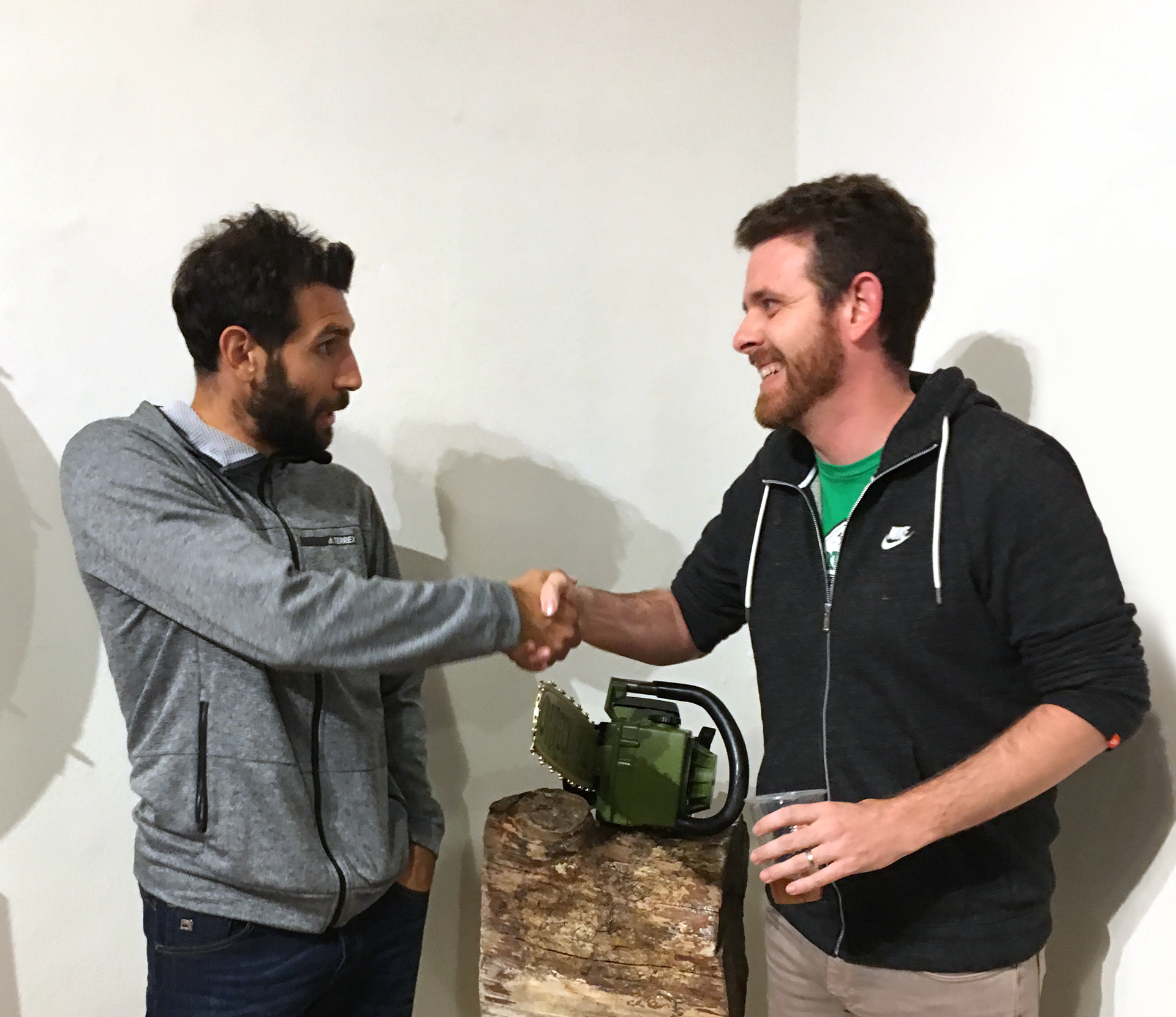
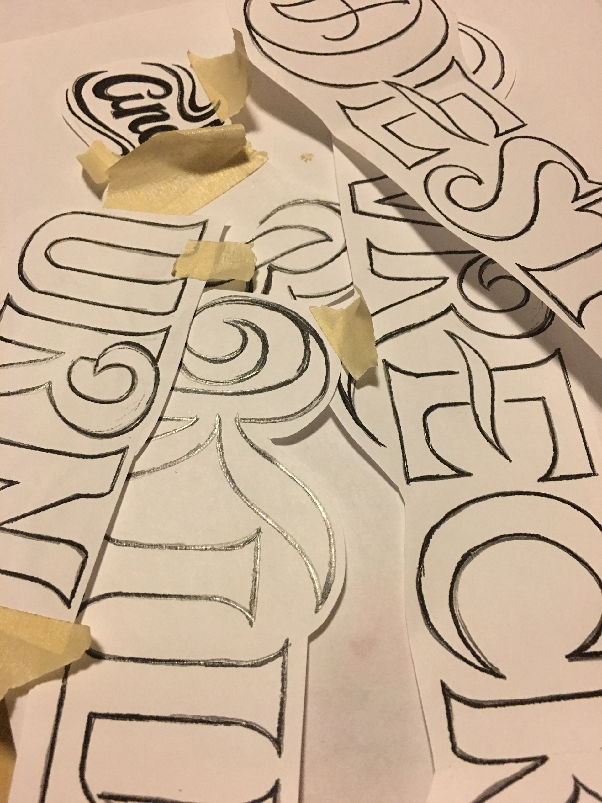
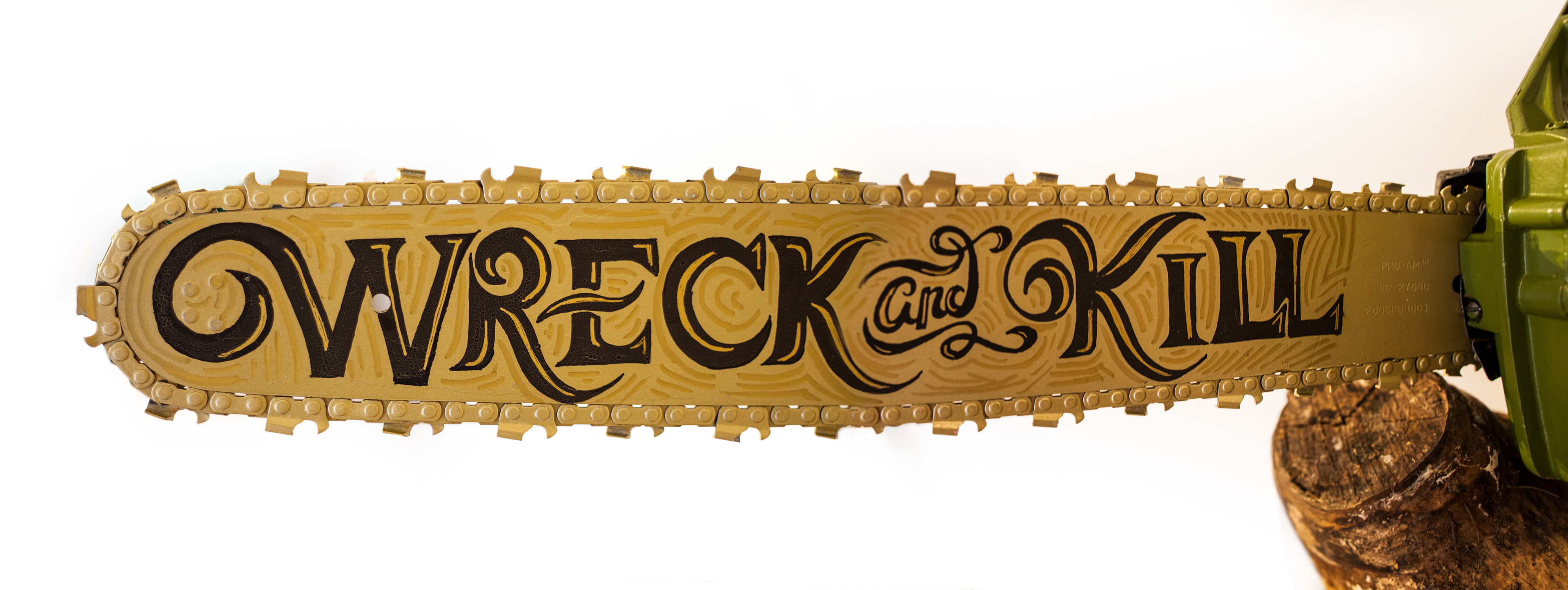
Art Without Pity : Timber Army Fundraiser
When the Timber Army comes calling, I usually start creating. What began as a dusty old storage saw was transformed with a little paint, elbow grease and hand type. As a long time fan, I wanted to use the vintage saw along with a retro timbers logo and even a phrase from an old chant that has been shelved to convey the club's past. In the end, the chainsaw was even purchased at auction by The Maestro himself, Diego Valeri, who I got to meet for the briefest of moments.

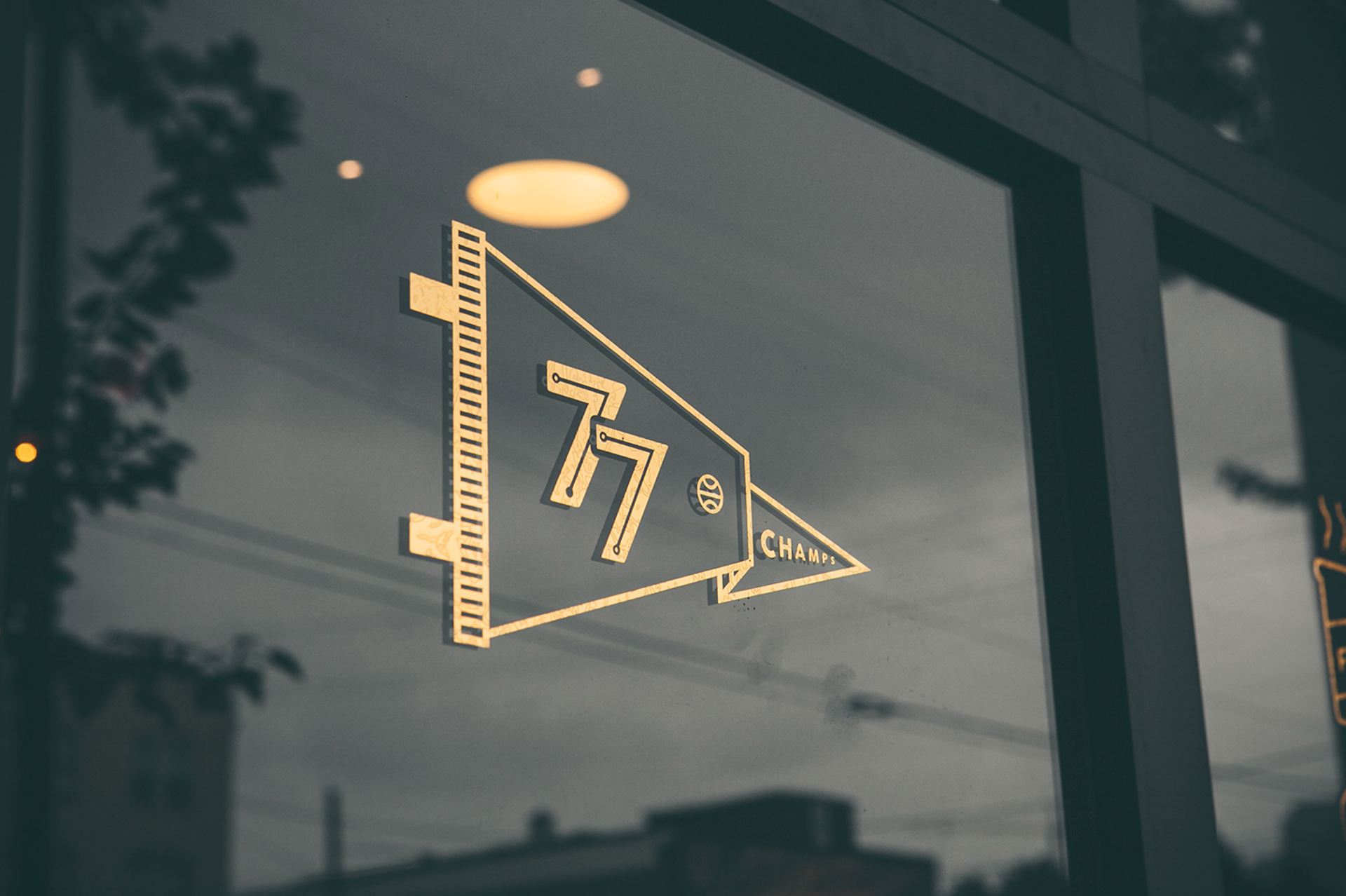
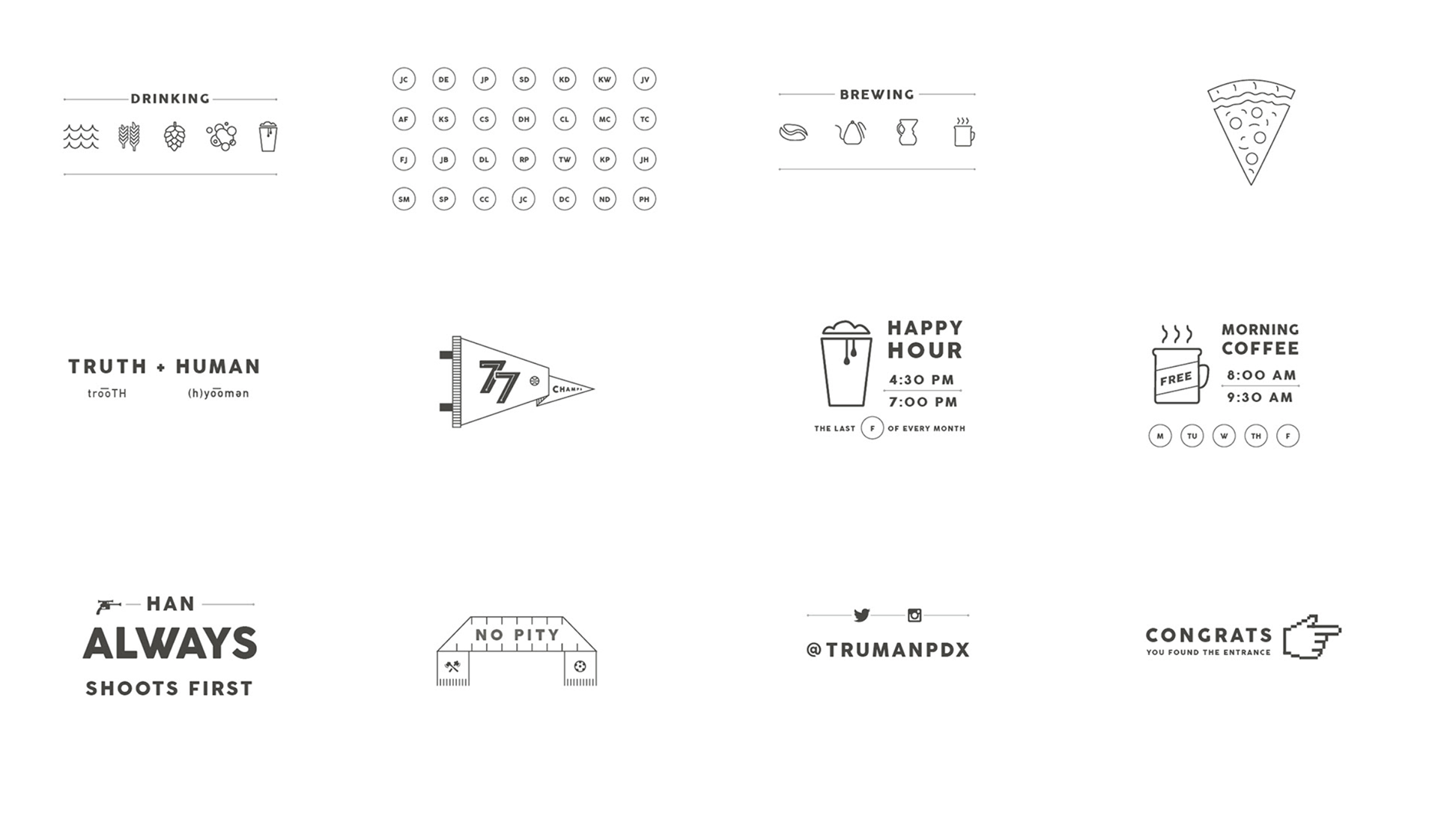
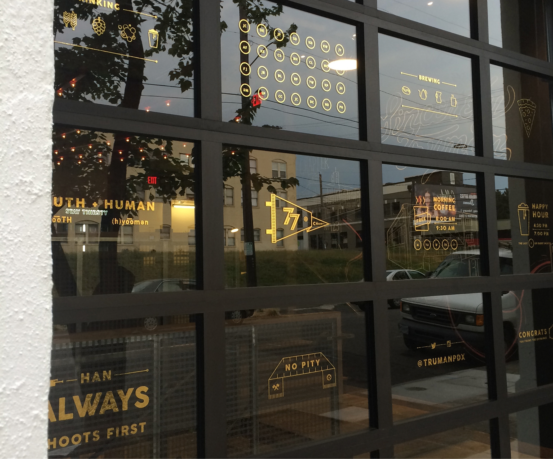
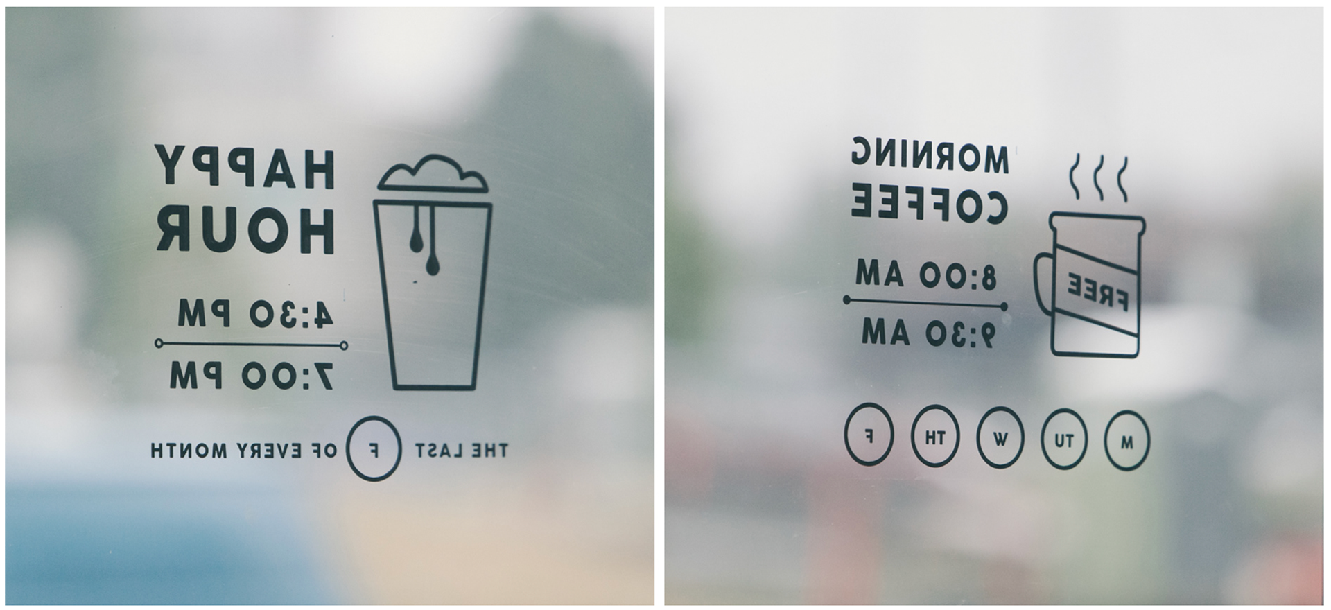
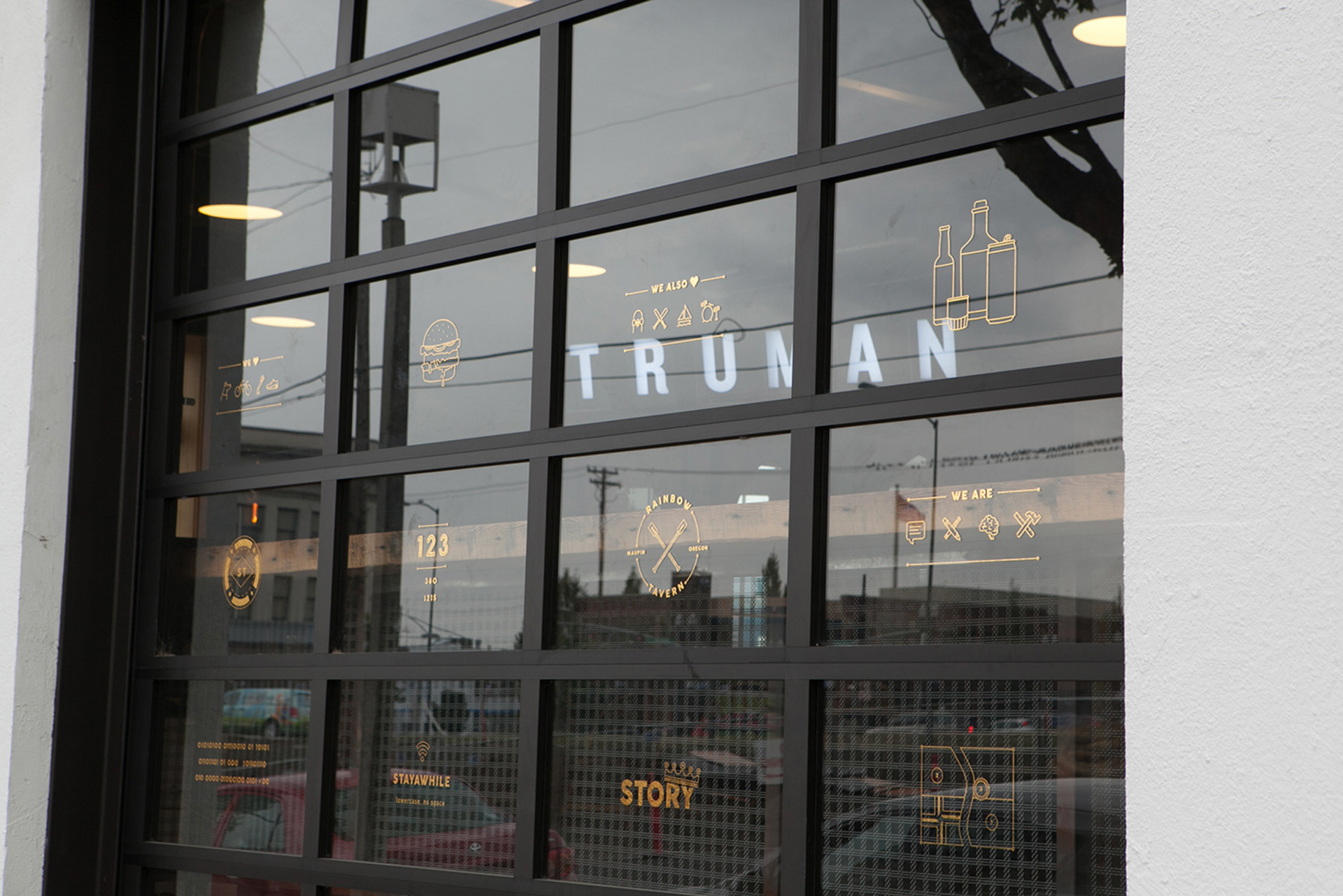
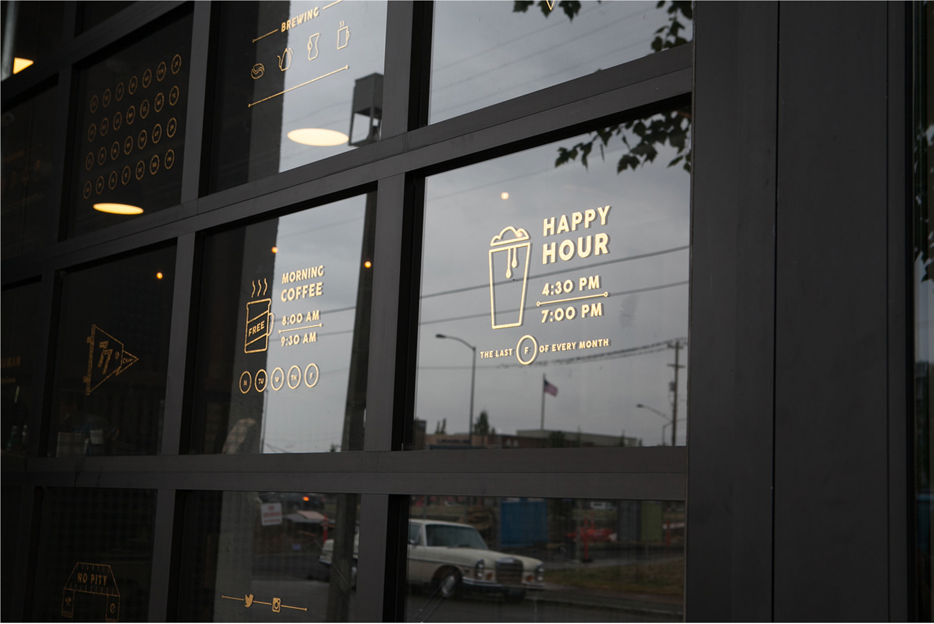
Welcome Window Type
When Sincerely Truman moved to a new location the design team set about making the place feel like home. I was tasked with designing the glass entry doors. I wanted to create something that was memorable, fun and inviting. It had to capture the agency personality while remaining functional. The glass garage doors allow light to filter down the entry stairs and keep the basement a bright space to work during Portland's dark grey winter months. The design also had to fit aesthetically with the brand new space.
I elected to create an icon series. The icons are a vinyl application, cut from some amazing gold textured material. Each icon represents an important aspect to Truman life. Some icons are extremely functional like the happy hour notice, and the coffee bar hours. Other icons are awesome things people at the agency love, like the Portland Timber scarf and the poker chip. A few icons ended up being super cryptic inside jokes, feel free to ask us to explain them.