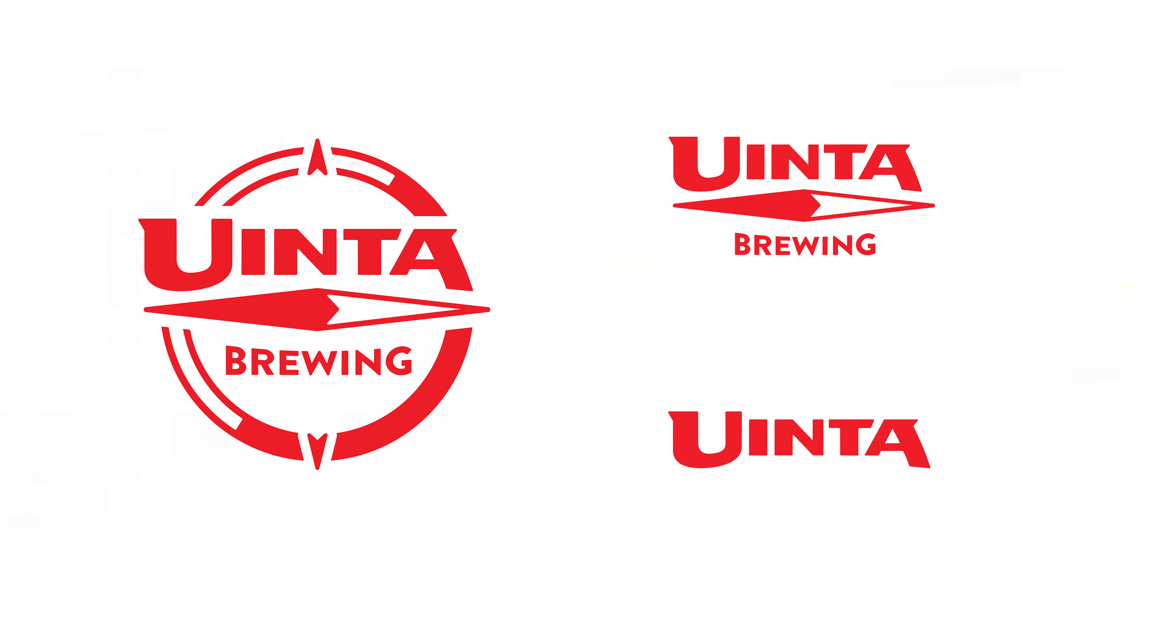
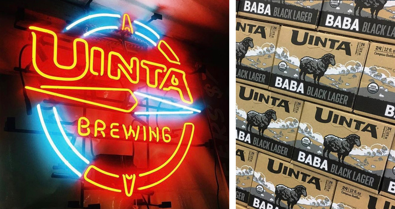
Sincerely Truman was approached by a Utah brewery in need of a brand refresh. They came across our internal beer project and thought we might be a good fit for the Uinta brand. We jumped at the chance to brand our favorite beverage and began with a deep dive into iconic beer, Uinta's past and just what brewing beer in Utah was all about. Tasked with evolving the current brand, we dialed up a wide range of truly interesting marks, that pushed the brand into revolutionary new territory. The final mark direction ended up retaining the use of the compass, Uinta’s long standing icon. “The compass symbolizes our adventurous spirit, sense of direction in brewing, and serves as a reminder to get out and get lost every once in awhile,” says Will Hamill, Uinta’s Founder. While the new logo eliminates Uinta’s namesake East to West running mountain range illustration, the E-W running compass needle remains as a nod to the quirky, a-typical range that, like the brewery, runs in it’s own direction.
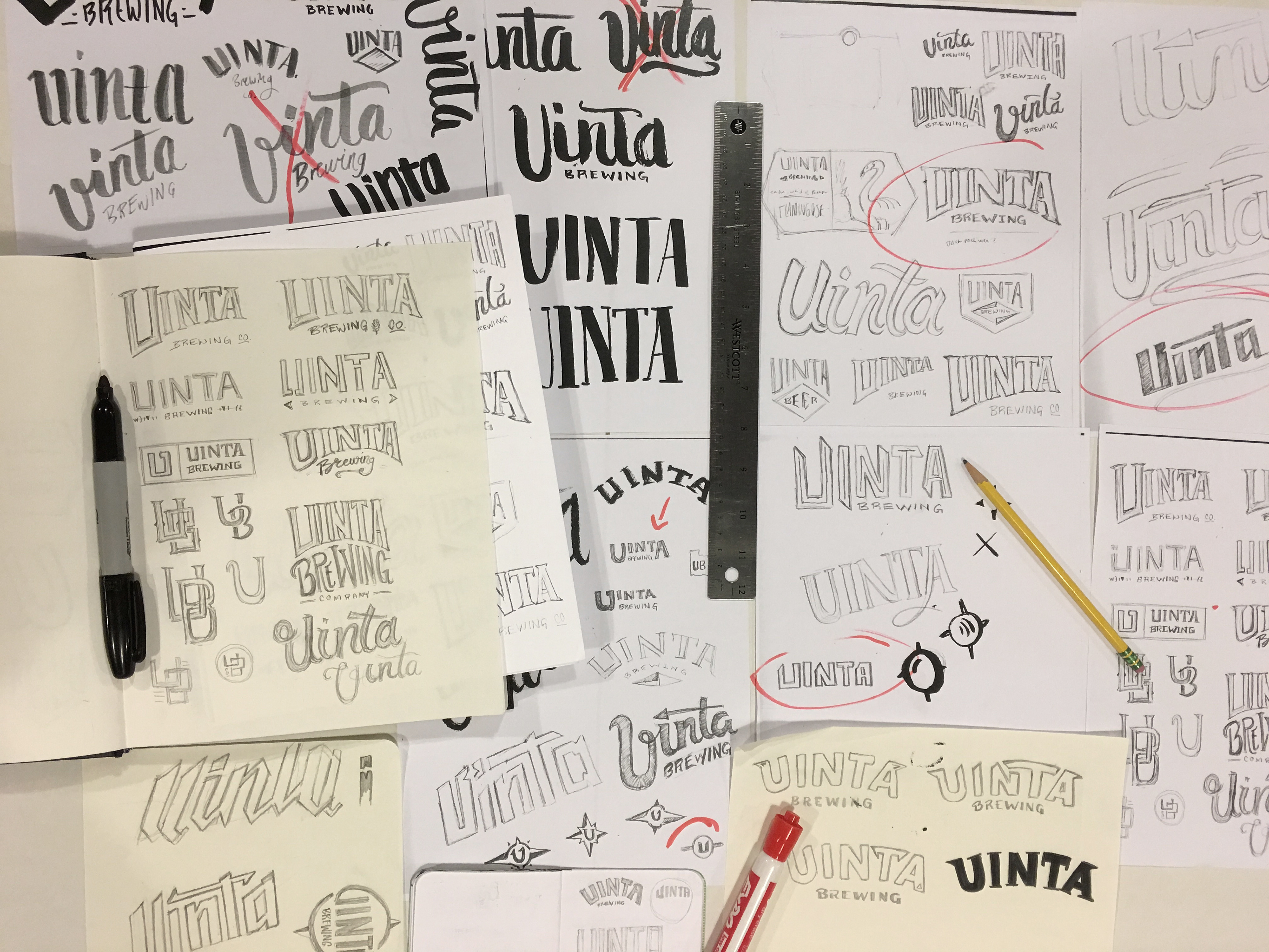
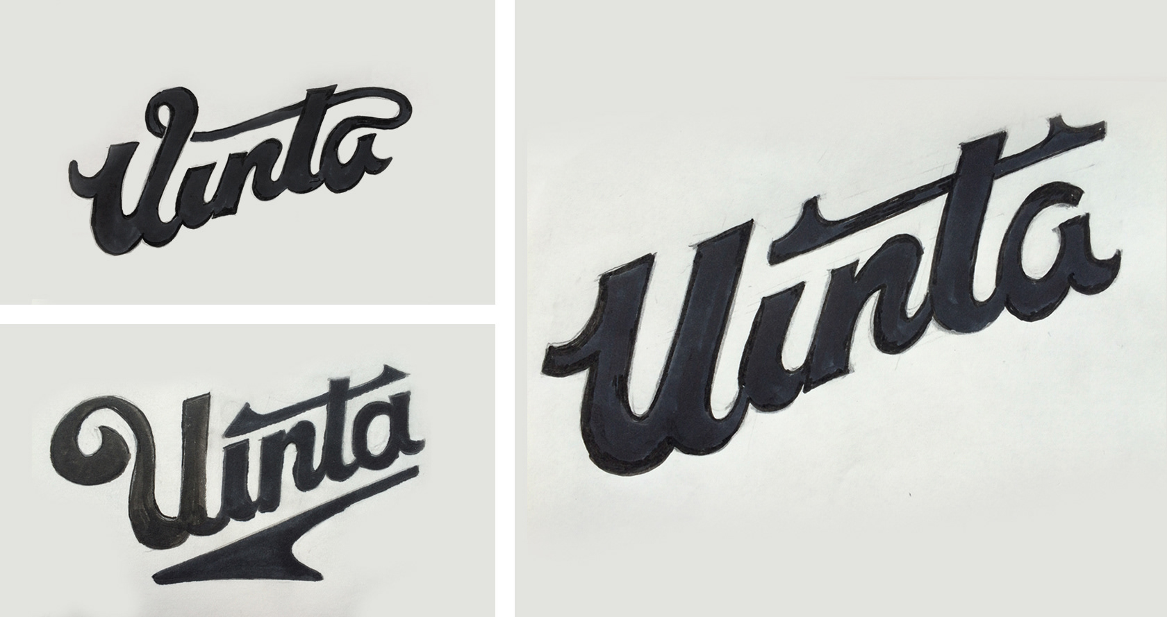
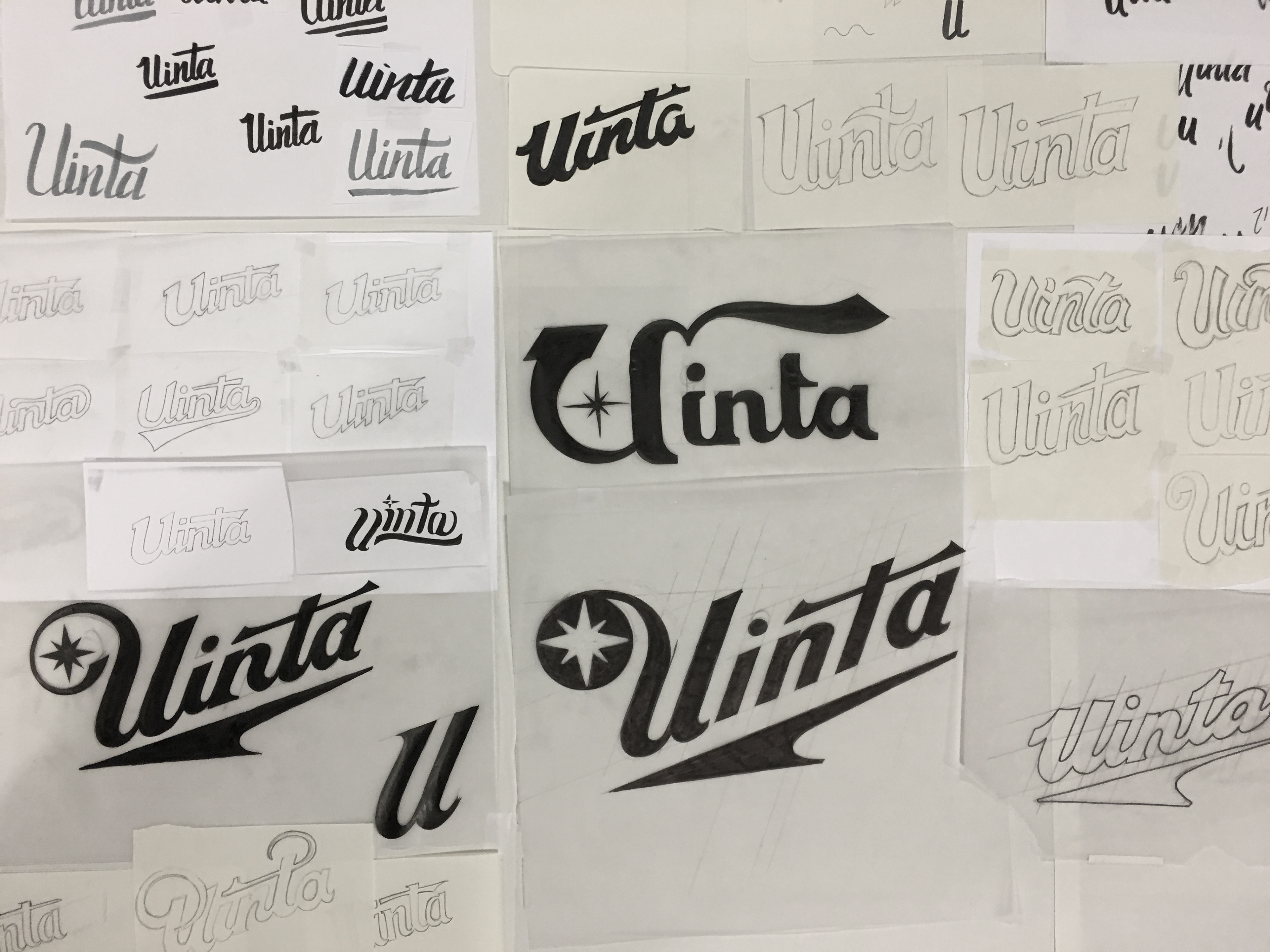
The following is quick overview of an extensive process that took many twists and turn. The final logo is one that should stand up for some time thanks to its timeless nature and flexible application options.
The following is quick overview of an extensive process that took many twists and turn. The final logo is one that should stand up for some time thanks to its timeless nature and flexible application options.
Creative Direction: Simon Armour
Art Direction: Calvin Ross Carl / Blakely Davidson
Lead Design: Tim Weakland
Design: Dillon Lawrence + Reid Stubblefield
Illustration: Bethany Ng
Art Direction: Calvin Ross Carl / Blakely Davidson
Lead Design: Tim Weakland
Design: Dillon Lawrence + Reid Stubblefield
Illustration: Bethany Ng
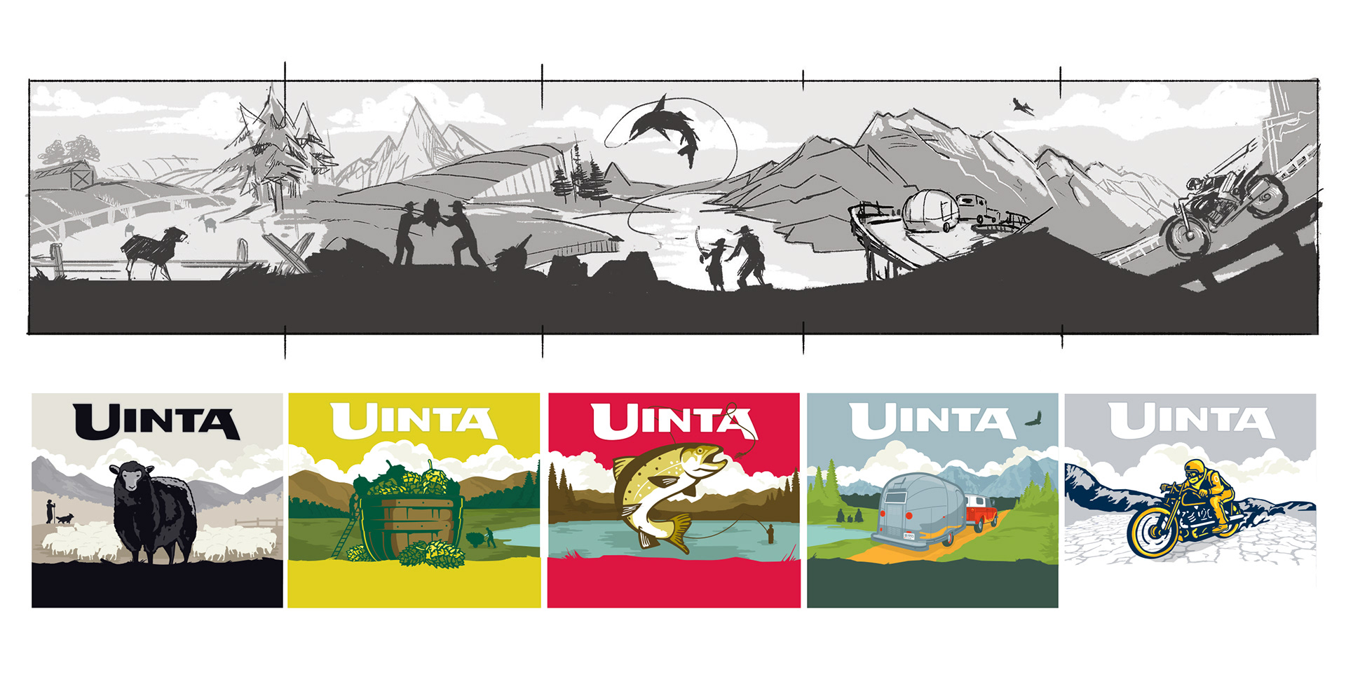
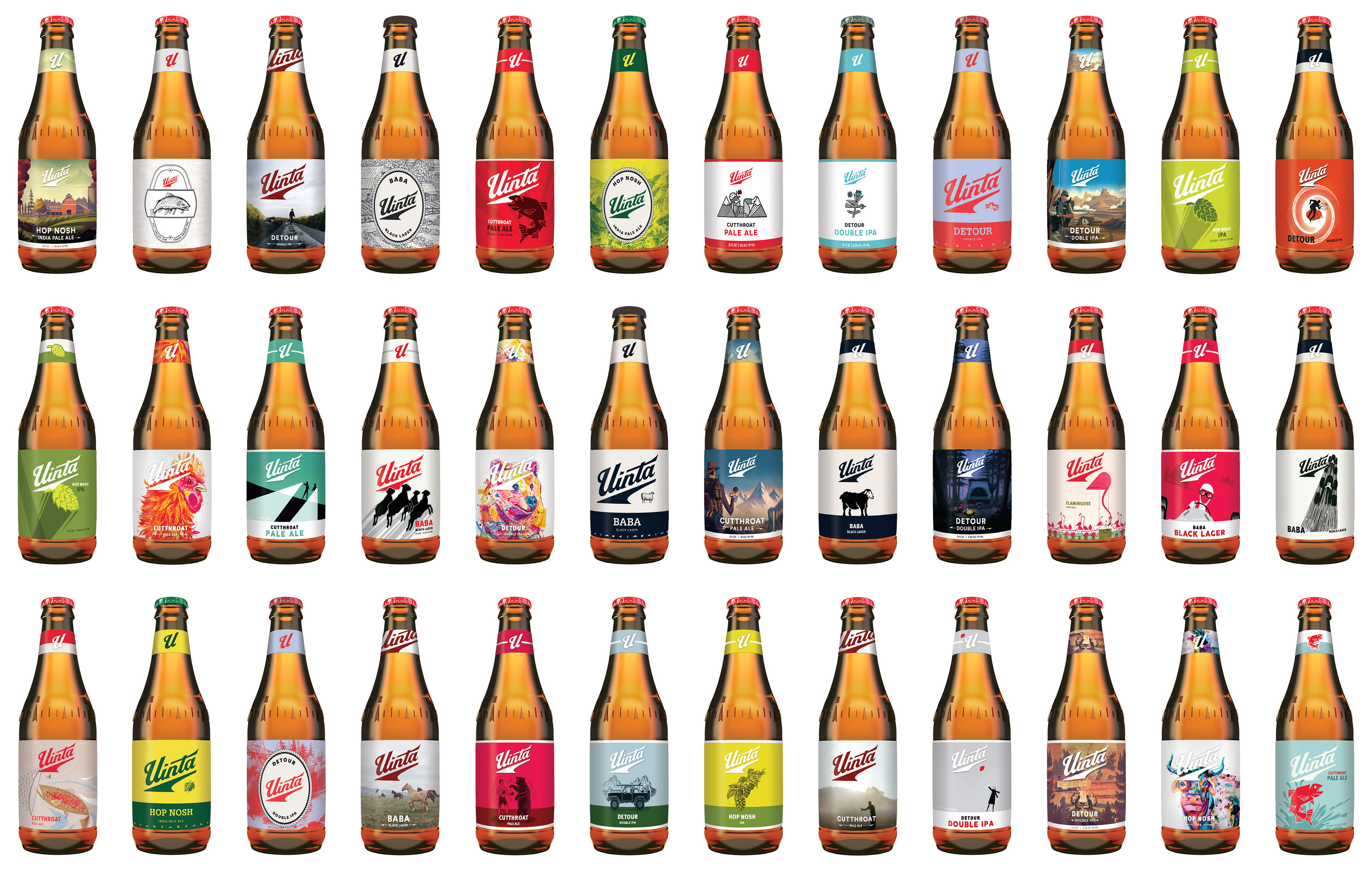
Sketches & concepting

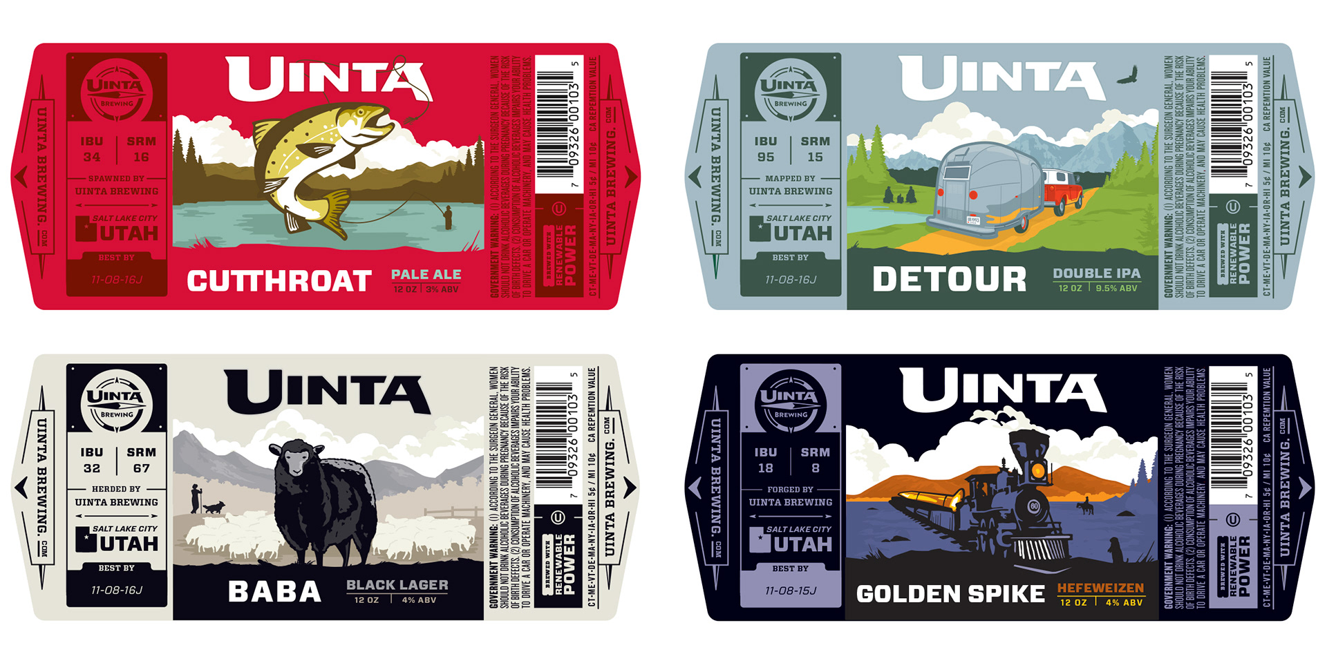
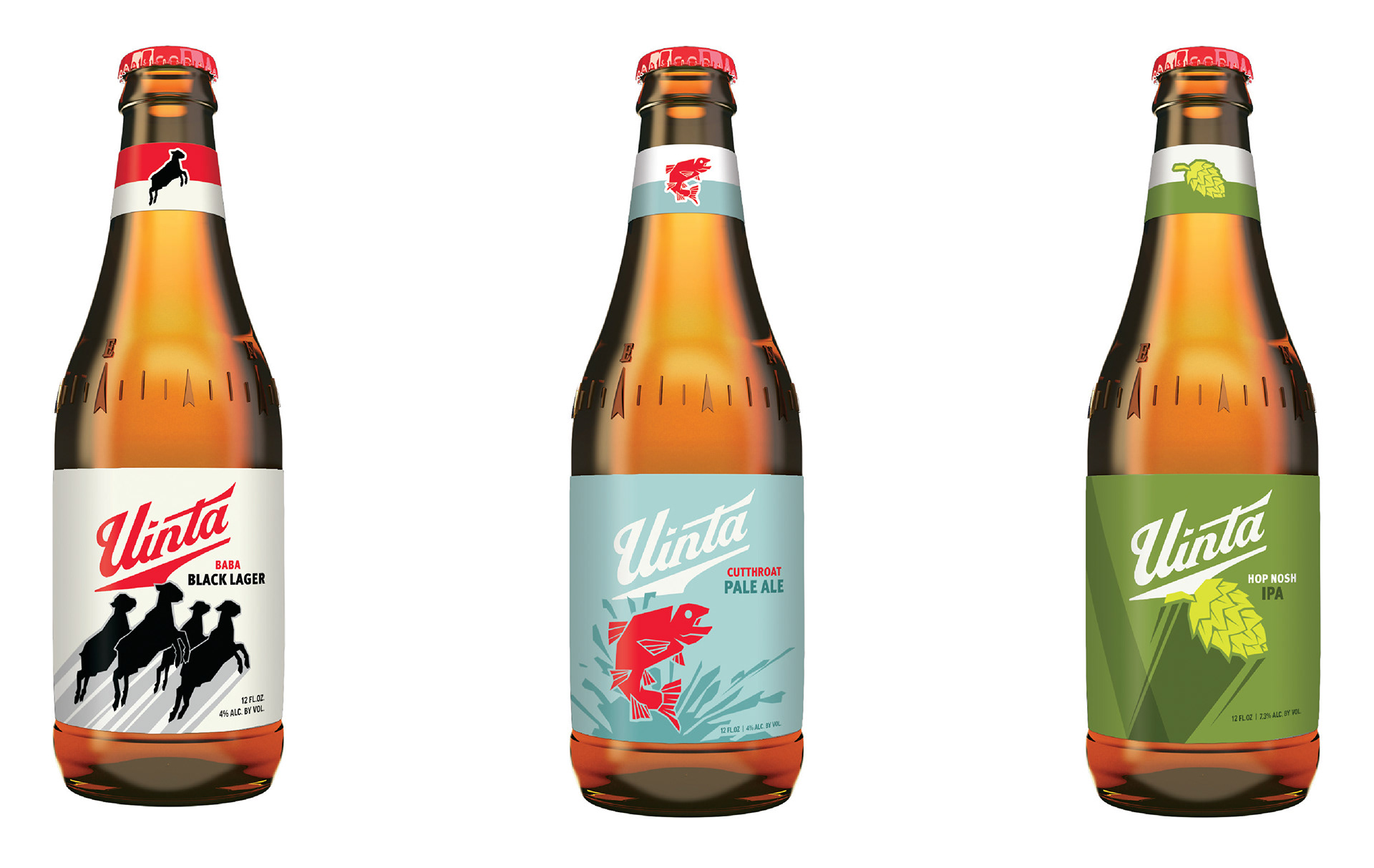
Early bottle concepts
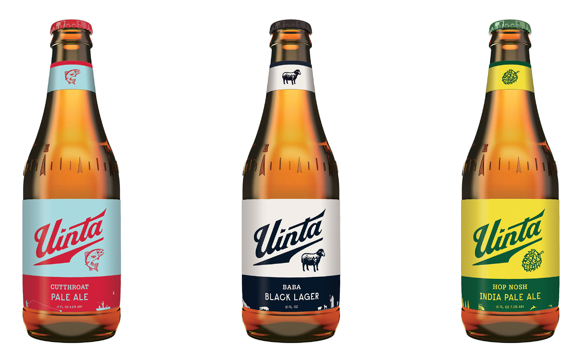
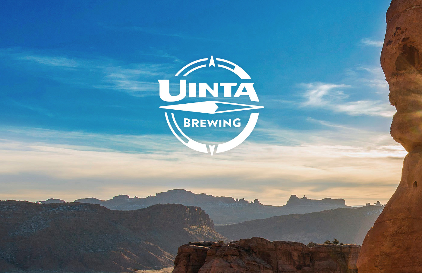
Final logo
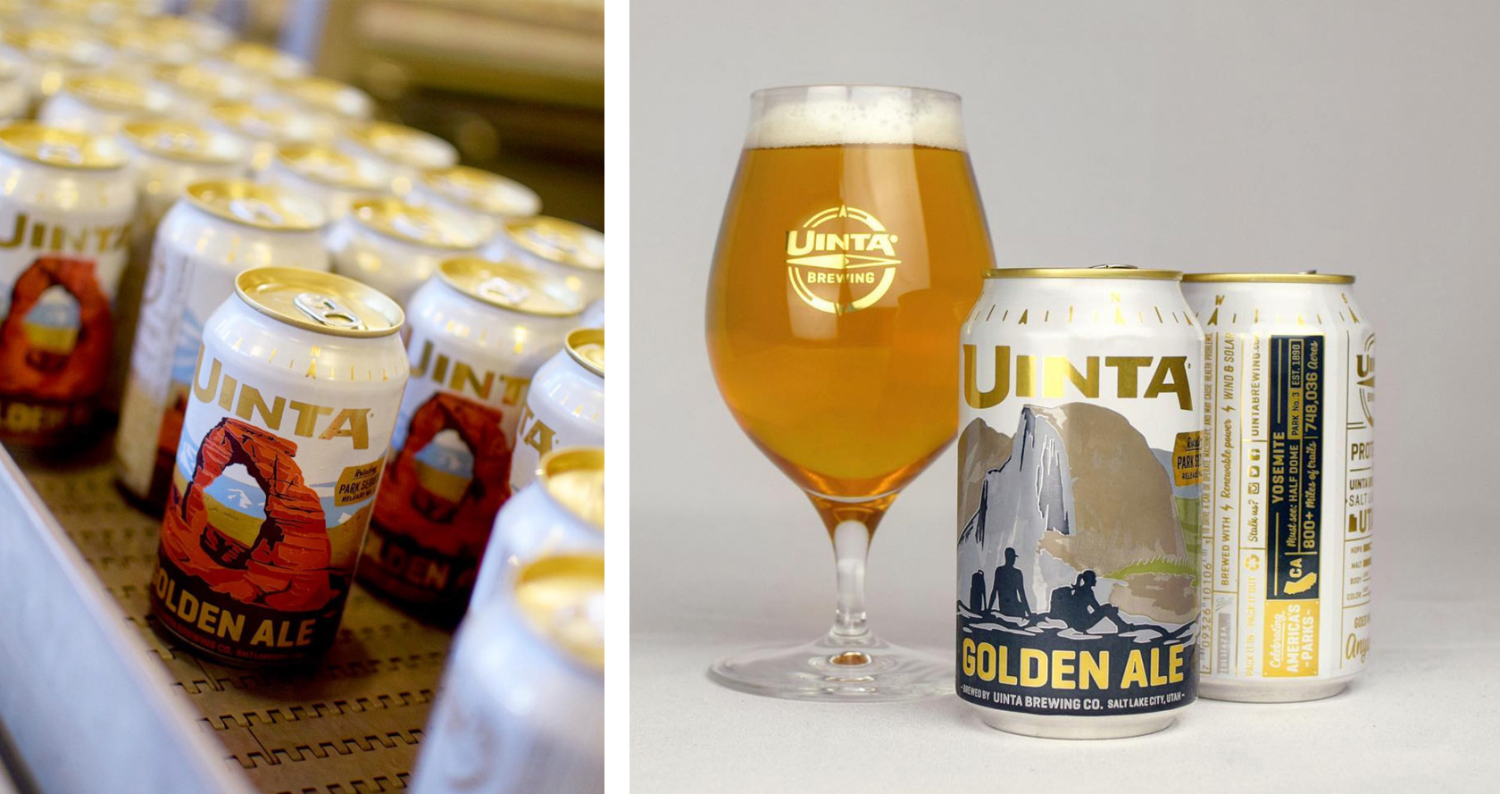
Logo in use
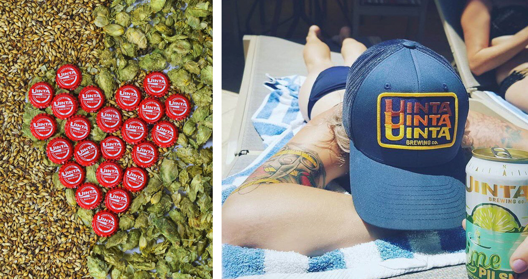
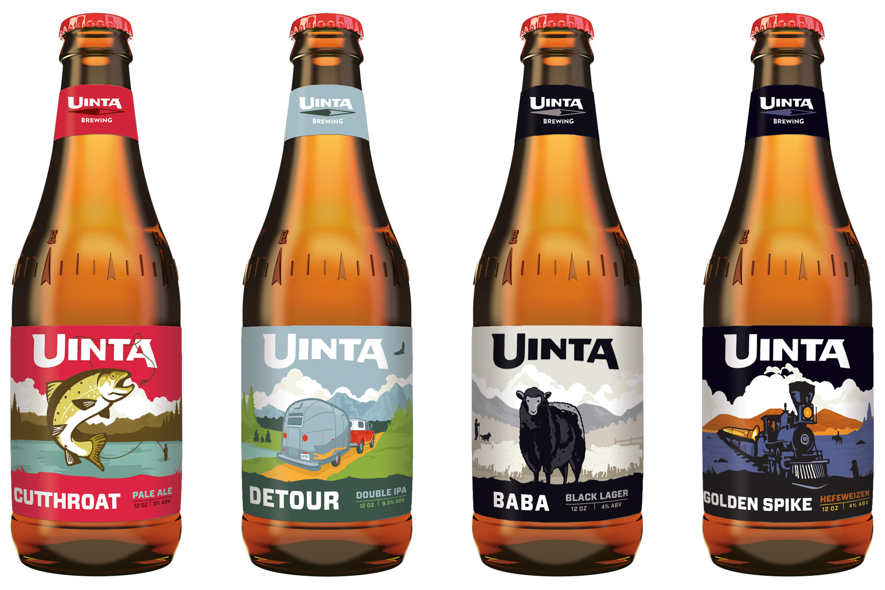
Packaging Design
Along with the logo, the ST team designed the initial direction for the label and packaging for Uinta's core family of beers. The plan was to illustrate a series of beer labels that, when shelved properly, would create one continuous scene for the brand and become an interesting story to tell. Connecting a sweeping landscape dove deep into Uinta's WPA inspired illustration style that was synonymous with the brand.